
히스토그램은 막대그래프와 유사하지만 연속형 변수를 시각화 한다는 점에서 차이가 있다.
ggplot2 패키지에서는 geom_histogram()로 히스토그램을 시각화 할 수 있음.
geom_histogram(
  mapping = NULL,
  data = NULL,
  stat = "bin",
  position = "stack",
  ...,
  binwidth = NULL,
  bins = NULL,
  na.rm = FALSE,
  orientation = NA,
  show.legend = NA,
  inherit.aes = TRUE
)
· binwidth: X축을 나누는 bin의 너비 설정, 숫자벡터를 사용할 수 있다. (bin과 binwidth는 동시에 사용될 수 없다)
· bins: X축을 나누는 bin의 개수 설정
00. 데이터 셋
·데이터는 ggplot2 패키지 데이터 셋인 'diamonds' 사용
library(ggplot2) # 패키지 로드

df <- diamonds
df %>% str()
df %>% head()
01. 기본 Histogram
ggplot(diamonds) +
  geom_histogram(aes(x  = carat))+
  ggtitle("")

02. 히스토그램 bin 조정
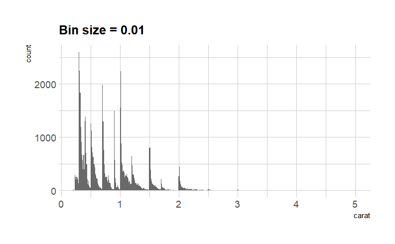
· binwidth = 0.01 Histogram
library(hrbrthemes)

ggplot(diamonds) +
  geom_histogram(aes(x=carat),
                    binwidth=0.01,
                    alpha=0.9) +
  ggtitle("Bin size = 0.01") +
  theme_ipsum() +
  theme(plot.title = element_text(size=15))
· bins= 0.01 Histogram
ggplot(diamonds) +
  geom_histogram(aes(x=carat),
                    bins = 200,
                    alpha=0.9) +
  ggtitle("Bins = 200") +
  theme_ipsum() +
  theme(plot.title = element_text(size=15))
03. 히스토그램 커스텀
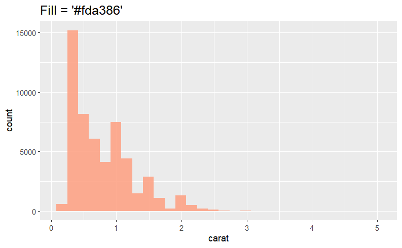
1) 단일 색상으로 내부 채우기
: fill = "컬러코드"
ggplot(diamonds) +
  geom_histogram(aes(x=carat),
                    alpha=0.9,
                    fill = "#fda386") +
  theme(plot.title = element_text(size=15))
2) 라인 색상 & 두께 지정
: color= "컬러코드" & size = n
ggplot(diamonds) +
  geom_histogram(aes(x=carat),
                    alpha=0.9,
                    fill = "#fda386", color = '#b7cace', size = 1.5) +
  ggtitle("Fill = '#fda386' & color = '#b7cace' ")+
  theme(plot.title = element_text(size=15))

4) scale_fill_gradient(low = "컬러코드" , high = "컬러코드")
ggplot(diamonds) +
  geom_histogram(aes(x = price , fill = ..x.. ))+
  scale_fill_gradient(low = "#CCE5FF", high =  "#FF00FF") +
  theme_classic() + labs(fill = "Labels Name")

04. 기본 히스토그램 + α
1) stack 형태
: 범주형 변수 cut을 fill에 지정 -> fill = "범주형 변수"
ggplot(diamonds) +
  geom_histogram(aes(x = price , fill = cut) , alpha = 0.68) +
  theme_classic() + labs(fill = "Labels Name")

2) dodge 형태
: position = 'dodge' 추가
ggplot(diamonds) +
  geom_histogram(aes(x = price , fill = cut) , alpha = 0.68,
                 position = 'dodge') +
  theme_classic() + labs(fill = "Labels Name")

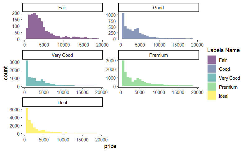
3) facet_wrap()으로 히스토그램 나눠 그리기
· 모두 동일한 x, y축 범위를 사용하는 경우 : scales = 'fixed' default
ggplot(diamonds) +
  geom_histogram(aes(x = price , fill = cut) , alpha = 0.6,
                 position = 'dodge') +
  facet_wrap(~cut , nrow = 3)+ # nrow = 3개의 행으로 나눠서 그래프를 그려줌
  theme_classic() + labs(fill = "Labels Name")

· cut별로 다른 x,y축 범위를 사용하는 경우
: scales = 'free' 사용
( 이 외에 'free_x', 'free_y' 사용 가능 )
ggplot(diamonds) +
  geom_histogram(aes(x = price , fill = cut) , alpha = 0.6,
                 position = 'dodge') +
  facet_wrap(~cut , scales = 'free',nrow = 3)+
  theme_classic() + labs(fill = "Labels Name")
참고 문헌(reference)
참고 서적 / 위키북스|Must Learning with R (개정판)
https://wikidocs.net/book/4315
Must Learning with R (개정판)
MustLearning with R 개정판입니다. 기존 제작한 책에서 다시 만들려고 했으나, 책의 구성이 어느정도 바뀐 부분도 있기 때문에 다시 새롭게 구성을 하였습…
wikidocs.net
참고 사이트
https://ggplot2.tidyverse.org/reference/geom_histogram.html
Histograms and frequency polygons — geom_freqpoly
Visualise the distribution of a single continuous variable by dividing the x axis into bins and counting the number of observations in each bin. Histograms (geom_histogram()) display the counts with bars; frequency polygons (geom_freqpoly()) display the co
ggplot2.tidyverse.org
https://m.blog.naver.com/PostView.naver?isHttpsRedirect=true&blogId=nife0719&logNo=220989543252
[R] ggplot2 패키지로 히스토그램 그리기
※ 히스토그램 그래프를 그리는데 ggplot2 패키지를 사용하였습니다. ※ 예제용 데이...
blog.naver.com
'R > ggplot2' 카테고리의 다른 글
| R | ggplot2 | Line Plot (0) | 2023.01.18 |
|---|---|
| R | ggplot2 | Scatter Plot(산점도) (0) | 2023.01.17 |
| R | ggplot2 | Boxplot (0) | 2023.01.16 |
| R | ggplot2 | Density Plot (밀도 플롯) (0) | 2023.01.16 |
| R | ggplot2 | bar chart (0) | 2023.01.03 |