Boxplot은 데이터를 요약하는 데 있어서 매우 유용한 그래프이다.
박스플롯을 그리기 위해서 x축은 Descrete(이산형) 변수를, y축에는 Continuous(연속형) 변수를 배치 해야 됨.
· Boxplot 구조

Boxplot은 자료에서 얻은 다섯 수치 요약(five number summary)을 가지고 그린다.
다섯 수치 요약은 아래와 같다.
- 최솟값 : 제 1사분위에서 1.5 IQR을 뺀 위치이다
- 제 1사분위(Q1) : 25%의 위치를 의미한다.
- 제 2사분위(Q2) : 50%의 위치로 중앙값(median)을 의미한다.
- 제 3사분위(Q3) : 75%의 위치를 의미한다.
- 최댓값 : 제 3사분위에서 1.5 IQR을 더한 위치이다.
IQR이란, Interquartile range의 약자로써 Q3 - Q1를 의미한다.
# Q3 - Q1: 사분위수의 상위 75% 지점의 값과 하위 25% 지점의 값 차이
ggplot2 패키지에서는 Boxplot을 그리기 위한 geom_boxplot() 함수를 제공한다.
geom_boxplot(
  mapping = NULL,
  data = NULL,
  stat = "boxplot",
  position = "dodge2",
  ...,
  outlier.colour = NULL,
  outlier.color = NULL,
  outlier.fill = NULL,
  outlier.shape = 19,
  outlier.size = 1.5,
  outlier.stroke = 0.5,
  outlier.alpha = NULL,
  notch = FALSE,
  notchwidth = 0.5,
  varwidth = FALSE,
  na.rm = FALSE,
  orientation = NA,
  show.legend = NA,
  inherit.aes = TRUE
)
· 주요 Argument
| Argument |
사용방법
|
설명
|
|
fill
|
1) mapping=aes(fill=컬럼이름)
2) fill='색상이름'
|
박스플롯 색상 채우기
- mapping=aes()의 인수로 사용 시,
범주형 변수(factor) 컬럼의 값에 따라 다른 색상 - 전체 박스플롯의 색상을 일괄적으로 지정할 경우, mapping=aes() 밖에 입력함
|
|
color
|
color='색상'
|
박스플롯 테두리 색상
|
|
varwidth
|
varwidth=TRUE
|
- FALSE : 표준 박스플롯.
(Default : FALSE)
- TRUE : 상자의 폭은 관측값 개수(n)의 제곱근에 비례함.
즉, 빈도수에 따라 너비에 가중치가 붙음(weighted) |
|
notch
|
notch=TRUE
|
중위값(Median)의 유의하게 다른 정도를 나타냄
- FALSE : 표준 박스플롯
(Default : FALSE)
- TRUE : notched boxplot 생성(Median에 톱니처럼 들어간 모양)
|
|
notchwidth
|
notchwidth=숫자
|
notched boxplot일 경우(notch=TRUE) notch의 폭을 지정함
(Default : notchwidth=0.5)
|
|
show.legend
|
show.legend=FALSE
|
TRUE : 범례를 포함함
(Default : TRUE)
FALSE : 범례를 포함하지 않음.
|
|
outlier.color
|
outlier.color='색상'
|
outlier의 테두리 색상 지정
|
|
outlier.fill
|
outlier.fill='색상'
|
outlier의 채우기 색상 지정
|
|
outlier.shape
|
outlier.shape=숫자
|
outlier의 모양 지정
|
|
outlier.size
|
outlier.size=숫자
|
outlier 점의 크기 지정
|
|
outlier.stroke
|
outlier.stroke=숫자
|
outlier 점의 테두리 두께 지정
|
|
outlier.alpha
|
outlier.alpha=숫자
|
outlier 점의 투명도 지정. (0~1 사이)
|
00. 사용 데이터
·데이터는 ggplot2 패키지 데이터 셋인 'mpg' 를 사용
library(ggplot2)
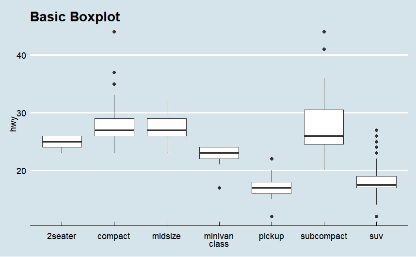
01. 기본 Boxplot
· x축을 class, y축을 hwy로 하는 박스플롯 그리기
ggplot(mpg)+
  geom_boxplot(aes(x=class, y = hwy))+
    labs(title = "Basic Boxplot")+
    theme_economist()
· x축을 hwy, y축을 class로 하는 박스플롯 그리기
ggplot(mpg)+
  geom_boxplot(aes(y=class, x = hwy))+
    labs(title = "Basic Boxplot")+
    theme_economist()

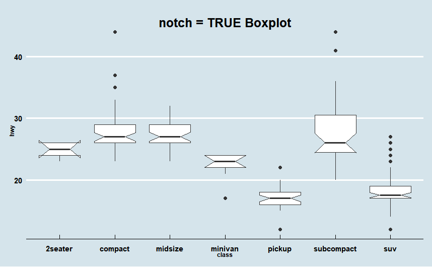
02. Notch = TRUE인 Boxplot
· notch 옵션은 중앙값에서 박스플롯의 상자가 톱니처럼 움푹 패이게 하는 것으로, 기본값은 notch=FALSE
· notch는 주로 그룹을 비교하는 데 사용되는 데, median 상부와 하부 영역의 노치가 겹치지 않으면 중위값(median)이 유의미하게 다르다는 것을 나타냄.
ggplot(mpg)+
  geom_boxplot(aes(x=class, y = hwy), notch = T)+
    labs(title = "Basic Boxplot")+
    theme_economist()
03. Boxplot 커스텀
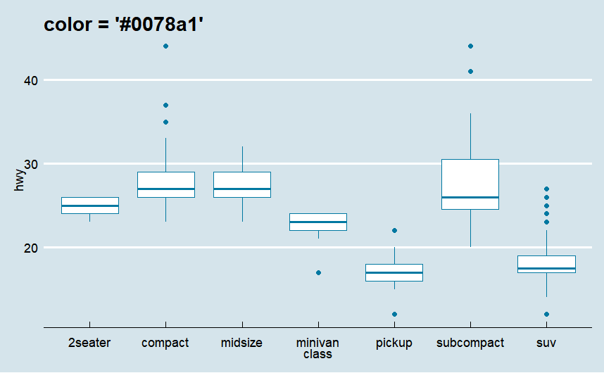
1) 박스플롯 테두리 색상 변경
·color = "컬러코드" 사용하여 변경
ggplot(mpg)+
  geom_boxplot(aes(x=class, y = hwy) , color = "#0078a1")+
  labs(title = "color = '#0078a1'")+
  theme_economist()
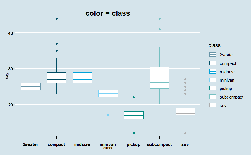
· aes(color = 범주형 변수) 지정해 색상 변경
ggplot(mpg)+
  geom_boxplot(aes(x=class, y = hwy, color = class))+
  labs(title = "color = class")+
  theme_economist()+
  scale_color_manual(values =economist_pal(fill = TRUE)(7))+

  theme(plot.title=element_text(family="nanumgothic", face="bold",
                                   hjust=0.5, vjust=-2, size=15),
          axis.text=element_text(family="nanumgothic", face="bold", size=9),
          axis.title =element_text(family="nanumgothic", face="bold", size=7),
          legend.text = element_text(family="nanumgothic", size=9),
          legend.position='right')
2) 박스플롯 채우기 색상 변경
·fill = "컬러코드" 사용하여 변경
ggplot(mpg)+
  geom_boxplot(aes(x=class, y = hwy) , fill = "#0078a1")+
  labs(title = "fill = '#0078a1'")+
  theme_economist()

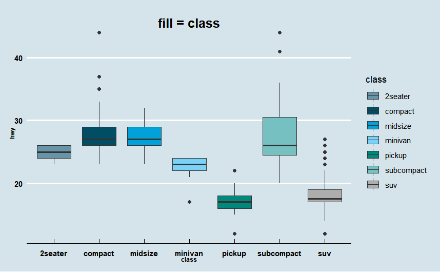
· aes(fill = 범주형 변수) 사용하여 변경
ggplot(mpg)+
  geom_boxplot(aes(x=class, y = hwy, fill = class))+
  labs(title = "fill = class")+
  theme_economist()+
  scale_fill_manual(values =economist_pal(fill = TRUE)(7))+

  theme(plot.title=element_text(family="nanumgothic", face="bold",
                                   hjust=0.5, vjust=-2, size=15),
          axis.text=element_text(family="nanumgothic", face="bold", size=9),
          axis.title =element_text(family="nanumgothic", face="bold", size=7),
          legend.text = element_text(family="nanumgothic", size=9),
          legend.position='right')

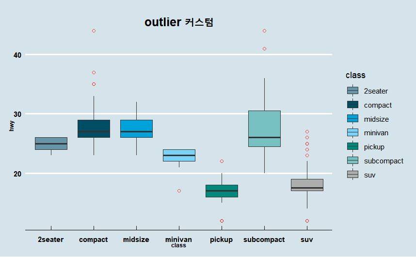
3) 이상치 색상, 모양 변경
· 색상 변경 : outlier.colour
· shape 변경 : outlier.shape
· 이상치 투명도 변경: outlier.alpha
ggplot(mpg)+
  geom_boxplot(aes(x=class, y = hwy, fill = class),
               outlier.colour = "red", # 이상치 색상 지정
               outlier.shape = 1,# 이상치 모양 변경
               outlier.alpha = 0.7)+ # 이상치 투명도 변경
  labs(title = "outlier 커스텀")+
  theme_economist()+
  scale_fill_manual(values =economist_pal(fill = TRUE)(7))+

  theme(plot.title=element_text(family="nanumgothic", face="bold",
                                   hjust=0.5, vjust=-2, size=15),
          axis.text=element_text(family="nanumgothic", face="bold", size=9),
          axis.title =element_text(family="nanumgothic", face="bold", size=7),
          legend.text = element_text(family="nanumgothic", size=9),
          legend.position='right')
4) 이상치 overlaying 해결 : geom_jitter()
· 이상치가 겹쳐서 그려지는 경우 geom_jitter()로 해결할 수 있음.
ggplot(mpg)+
  geom_boxplot(aes(x=class, y = hwy, fill = class),
               outlier.shape = NA)+ # 이상치 모양 변경
  geom_jitter(aes(x= class, y= hwy, col = class),alpha = 0.3) +
  labs(title = "geom_jitter")+
  theme_economist()+
  scale_fill_manual(values =economist_pal(fill = TRUE)(7))+

  theme(plot.title=element_text(family="nanumgothic", face="bold",
                                   hjust=0.5, vjust=-2, size=15),
          axis.text=element_text(family="nanumgothic", face="bold", size=9),
          axis.title =element_text(family="nanumgothic", face="bold", size=7),
          legend.text = element_text(family="nanumgothic", size=9),
          legend.position='right')

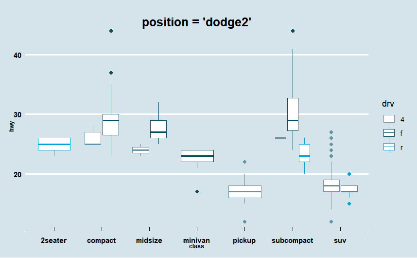
04. Position = "dodge2" Boxplot
· geom_boxplot은 기본적으로 position = "dodge2" 가 default 값이다
· x축에 범주형 변수 class, y축에 숫자형 변수(연속형) hwy,
mapping 안에 fill or color에 범주형 변수를 지정하면 자동으로 dodge 박스플롯이 그려진다.
ggplot(mpg)+
  geom_boxplot(aes(x=class, y = hwy, color = drv))+
  labs(title = "position = 'dodge2'")+
  theme_economist()+
  scale_color_manual(values =economist_pal(fill = TRUE)(3))+

  theme(plot.title=element_text(family="nanumgothic", face="bold",
                                   hjust=0.5, vjust=-2, size=15),
          axis.text=element_text(family="nanumgothic", face="bold", size=9),
          axis.title =element_text(family="nanumgothic", face="bold", size=7),
          legend.text = element_text(family="nanumgothic", size=9),
          legend.position='right')
참고 문헌(reference)
참고 서적 / 위키북스|Must Learning with R (개정판)
https://wikidocs.net/book/4315
Must Learning with R (개정판)
MustLearning with R 개정판입니다. 기존 제작한 책에서 다시 만들려고 했으나, 책의 구성이 어느정도 바뀐 부분도 있기 때문에 다시 새롭게 구성을 하였습…
wikidocs.net
참고 사이트
https://ggplot2.tidyverse.org/reference/geom_boxplot.html
A box and whiskers plot (in the style of Tukey) — geom_boxplot
The boxplot compactly displays the distribution of a continuous variable. It visualises five summary statistics (the median, two hinges and two whiskers), and all "outlying" points individually.
ggplot2.tidyverse.org
[R] ggplot(), geom_boxplot() (1) 박스플롯 기본 : 박스플롯 그리기, 변수별 값의 분포 나타내기(최대값,
1. 박스플롯(Boxplot)의 개념 박스플롯(Boxplot)은 국내에서는 상자그림, 상자도표라고도 합니다. 상자그...
blog.naver.com
https://leebaro.tistory.com/entry/%EB%B0%95%EC%8A%A4-%ED%94%8C%EB%A1%AFbox-plot-%EC%84%A4%EB%AA%85
박스 플롯(box plot) 설명
오늘 아는 분이 박스 플롯의 의미가 무엇이고 어떻게 그리는지 궁금하다고 말씀하셔서 이야기 나온김에 정리를 해본다. 박스 플롯을 사용하는 이유는 많은 데이터를 눈으로 확인하기 어려울 때
leebaro.tistory.com
'R > ggplot2' 카테고리의 다른 글
| R | ggplot2 | Line Plot (0) | 2023.01.18 |
|---|---|
| R | ggplot2 | Scatter Plot(산점도) (0) | 2023.01.17 |
| R | ggplot2 | Density Plot (밀도 플롯) (0) | 2023.01.16 |
| R | ggplot2 | Histogram (0) | 2023.01.10 |
| R | ggplot2 | bar chart (0) | 2023.01.03 |