
Scatter Plot , 산점도는 두 개의 연속형(continuous) 데이터의 상관관계를 파악하기에 매우 유용한 그래프이다.
ggplot2 패키지에서는 Scatter Plot을 그리기 위한 geom_point() 함수를 제공한다.
geom_point(
  mapping = NULL,
  data = NULL,
  stat = "identity",
  position = "identity",
  ...,
  na.rm = FALSE,
  show.legend = NA,
  inherit.aes = TRUE
)
· 주요 Argument
| Argument | 사용 방법 | 설명 |
| stroke | point의 외곽 라인의 두께 지정 1) stroke = 1 |
|
| fill | point의 채우기 색상 1) fill = "컬러코드" |
1) mapping 밖에 사용할 경우 point의 채우기 색상 |
| color | point의 외곽 라인 색상 지정 1) color = "컬러코드" 2) aes(color = 범주형변수) 3) aes(color = 숫자형변수) |
1) mapping 밖에 사용할 경우 point 외곽 색상을 지정할 수 있음 2) mapping 안에 color를 범주형 변수로 지정해서 채우기 색을 범주별로 달리 할 수 있음. 3) mapping 안에 color를 숫자형 변수로 지정해서 채우기 색을 값의 크기대로 그라데이션으로 표현 가능. |
| shape | point의 모양을 지정할 수 있음 1) shape = 1 2) aes(shape = 범주형 변수) |
1) shape의 경우 0~25까지 모양이 정해져 있음 (참고 http://www.sthda.com/english/wiki/ggplot2-point-shapes) 2) mapping 안에 shape을 범주형 변수로 지정할 경우 |
| alpha | alpha = n | 0 <= n <= 1, 0으로 갈수록 투명해짐 산점도의 경우 점들이 겹쳐서 그려지는 경우가 많으므로 alpha 값을 조절해서 사용하는 경우가 많음. |
| size | point의 사이즈 1) size = 1 2) aes(size = 숫자형 변수) |
2) mapping 안에 size를 숫자형 변수로 지정할 경우 숫자형 변수의 크기에 따라 point가 그려짐(버블차트) |
00. 사용 데이터
· R 내장 데이터셋인 'mtcars' 사용
data("mtcars")
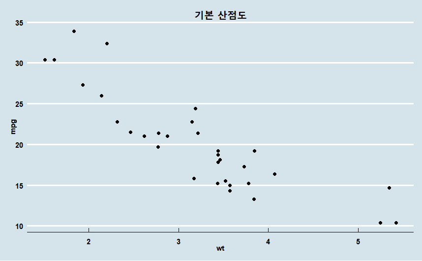
01. 기본 Scatter Plot
· mtcars의 wt 변수와 mpg 변수의 관계를 산점도로 plotting
ggplot(mtcars) +
  geom_point(aes(x = wt,  y = mpg))+
  labs(title = "기본 산점도")+

  # 추가 테마 설정
  theme_economist()+
  theme(plot.title=element_text(family="nanumgothic", face="bold",
                                   hjust=0.5, vjust=1, size=15),
        axis.text=element_text(family="nanumgothic", face="bold", size=9),
        axis.title =element_text(family="nanumgothic", face="bold", size=9),
        legend.text = element_text(family="nanumgothic", size=9),
        legend.position='right')
02. aesthetic mappings 추가
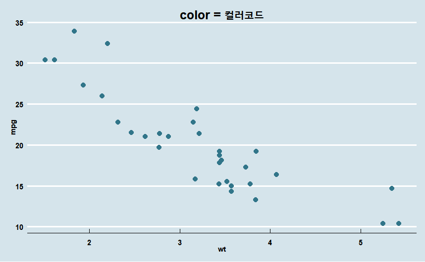
02-1. Color
1) color = "컬러코드"
· mapping 밖에 color = "컬러코드" 지정
ggplot(mtcars) +
  geom_point(aes(x = wt,  y = mpg), color = "#317589", size = 2.5)+
  labs(title = "color = 컬러코드")+

  theme_economist()+
  theme(plot.title=element_text(family="nanumgothic", face="bold",
                                   hjust=0.5, vjust=1, size=15),
        axis.text=element_text(family="nanumgothic", face="bold", size=9),
        axis.title =element_text(family="nanumgothic", face="bold", size=9))
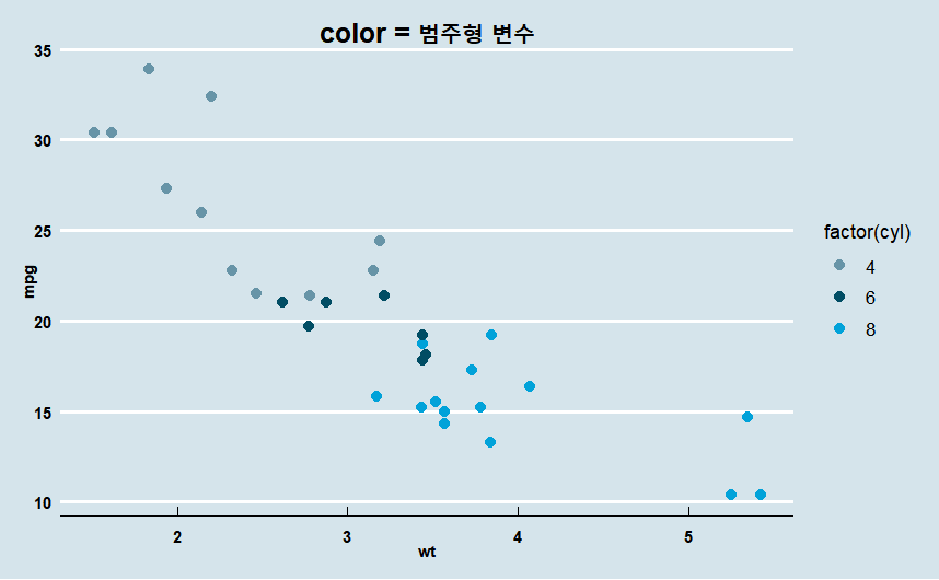
2) mapping 안에 color = 범주형 변수
· x = wt, y = mpg, color = factor(cyl)
ggplot(mtcars) +
  geom_point(aes(x = wt,  y = mpg, color = factor(cyl)), size = 2.5)+
  labs(title = "color = 범주형 변수")+

  theme_economist()+
  scale_color_manual(values =economist_pal(fill = TRUE)(3))+
  theme(plot.title=element_text(family="nanumgothic", face="bold",
                                   hjust=0.5, vjust=1, size=15),
        axis.text=element_text(family="nanumgothic", face="bold", size=9),
        axis.title =element_text(family="nanumgothic", face="bold", size=9),
        legend.text = element_text(family="nanumgothic", size=10),
        legend.position='right')
3) mapping 안에 color = 숫자형 변수
· x = wt, y = mpg, color = qsec
ggplot(mtcars) +
  geom_point(aes(x = wt,  y = mpg, color = qsec), size = 3)+
  labs(title = "color = 숫자형 변수")+
  scale_color_gradient(low = "#94b4c6", high =  "#16495e") + # 연속형 변수 색상 지정

  theme_economist()+
  theme(plot.title=element_text(family="nanumgothic", face="bold",
                                   hjust=0.5, vjust=1, size=15),
        axis.text=element_text(family="nanumgothic", face="bold", size=9),
        axis.title =element_text(family="nanumgothic", face="bold", size=9),
        legend.text = element_text(family="nanumgothic", size=10),
        legend.position='right')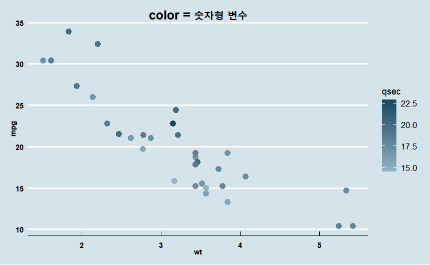
02-2. Shape
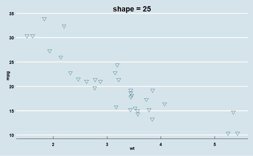
1) shape = 숫자( 0~25 )
ggplot(mtcars) +
  geom_point(aes(x = wt,  y = mpg),
             color = "#317589",
             size = 2.5,
             shape = 25)+
  labs(title = "color = 컬러코드")+

  theme_economist()+
  theme(plot.title=element_text(family="nanumgothic", face="bold",
                                   hjust=0.5, vjust=1, size=15),
        axis.text=element_text(family="nanumgothic", face="bold", size=9),
        axis.title =element_text(family="nanumgothic", face="bold", size=9))
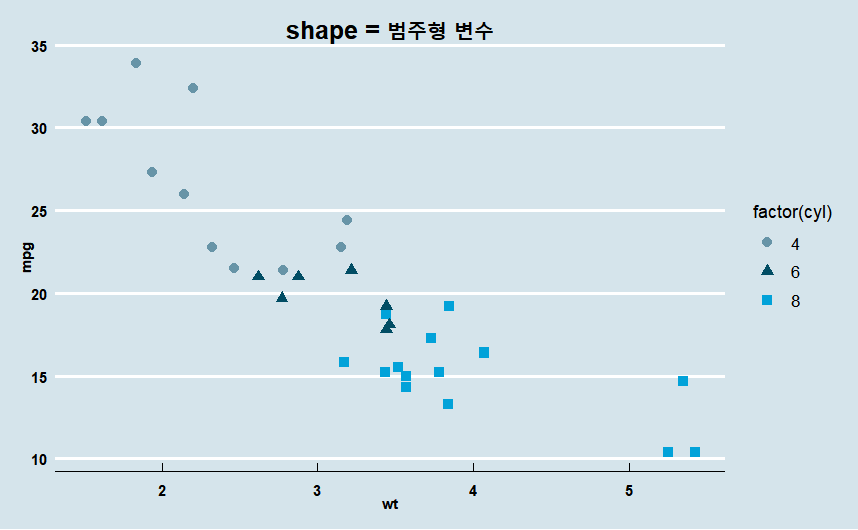
2) mapping 안에 shape = 범주형 변수
· x = wt, y = mpg, color = factor(cyl) , shape = factor(cyl)
ggplot(mtcars) +
  geom_point(aes(x = wt,  y = mpg,
                 color = factor(cyl),
                 shape = factor(cyl)),
             size = 2.5)+
  labs(title = "shape = 범주형 변수")+

  theme_economist()+
  scale_color_manual(values =economist_pal(fill = TRUE)(3))+
  theme(plot.title=element_text(family="nanumgothic", face="bold",
                                   hjust=0.5, vjust=1, size=15),
        axis.text=element_text(family="nanumgothic", face="bold", size=9),
        axis.title =element_text(family="nanumgothic", face="bold", size=9),
        legend.text = element_text(family="nanumgothic", size=10),
        legend.position='right')
02-3. Size
1) size = 숫자
· 바로 위에 그린 plot의 point 사이즈 키우기
ggplot(mtcars) +
  geom_point(aes(x = wt,  y = mpg,
                 color = factor(cyl),
                 shape = factor(cyl)),
             size = 5)+
  labs(title = "size = 5")+

  theme_economist()+
  scale_color_manual(values =economist_pal(fill = TRUE)(3))+
  theme(plot.title=element_text(family="nanumgothic", face="bold",
                                   hjust=0.5, vjust=1, size=15),
        axis.text=element_text(family="nanumgothic", face="bold", size=9),
        axis.title =element_text(family="nanumgothic", face="bold", size=9),
        legend.text = element_text(family="nanumgothic", size=10),
        legend.position='right')

2) mapping 안에 size = 숫자형 변수 --> Bubble Chart
· size = qsec(숫자형) 지정해 줌으로써 버블 차트를 그릴 수 있음.
ggplot(mtcars) +
  geom_point(aes(x = wt,  y = mpg,
                 size = qsec))+
  labs(title = "Bubble Chart : size = qsec")+

  theme_economist()+
  theme(plot.title=element_text(family="nanumgothic", face="bold",
                                   hjust=0.5, vjust=1, size=15),
        axis.text=element_text(family="nanumgothic", face="bold", size=9),
        axis.title =element_text(family="nanumgothic", face="bold", size=9),
        legend.text = element_text(family="nanumgothic", size=10),
        legend.position='right')

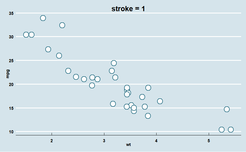
02-4. Stroke
1) Stroke = 1
ggplot(mtcars, aes(x = wt, y = mpg)) +
  geom_point(shape = 21,
             colour = "#317589", # point 외곽선 색상 지정
             fill = "white", # point 채우기 색상 지정
             size = 5,
             stroke = 1)+
  labs(title = "stroke = 1")+

  theme_economist()+
  theme(plot.title=element_text(family="nanumgothic", face="bold",
                                   hjust=0.5, vjust=1, size=15),
        axis.text=element_text(family="nanumgothic", face="bold", size=9),
        axis.title =element_text(family="nanumgothic", face="bold", size=9))
2) Stroke = 5
ggplot(mtcars, aes(x = wt, y = mpg)) +
  geom_point(shape = 21,
             colour = "#317589", # point 외곽선 색상 지정
             fill = "white", # point 채우기 색상 지정
             size = 5,
             stroke = 5)+
  labs(title = "stroke = 5")+

  theme_economist()+
  theme(plot.title=element_text(family="nanumgothic", face="bold",
                                   hjust=0.5, vjust=1, size=15),
        axis.text=element_text(family="nanumgothic", face="bold", size=9),
        axis.title =element_text(family="nanumgothic", face="bold", size=9)

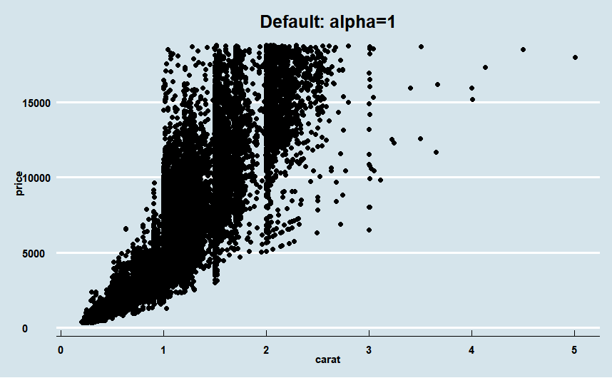
02-5. Alpha
· ggplot2 패키지 데이터 셋인 'diamonds' 사용
· 데이터의 사이즈가 큰 경우 alpha 값을 적절히 조절해서 사용하는 것이 좋음.
1) default 값 사용 (alpha = 1)
ggplot(diamonds)+
  geom_point(aes(x = carat, y= price))+
  labs(title = "Default: alpha=1")+

  theme_economist()+
  theme(plot.title=element_text(family="nanumgothic", face="bold",
                                   hjust=0.5, vjust=1, size=15),
        axis.text=element_text(family="nanumgothic", face="bold", size=9),
        axis.title =element_text(family="nanumgothic", face="bold", size=9))
2) alpha = 0.1
ggplot(diamonds)+
  geom_point(aes(x = carat, y= price)
             , alpha = 0.1)+
  labs(title = "alpha = 0.5")+

  theme_economist()+
  theme(plot.title=element_text(family="nanumgothic", face="bold",
                                   hjust=0.5, vjust=1, size=15),
        axis.text=element_text(family="nanumgothic", face="bold", size=9),
        axis.title =element_text(family="nanumgothic", face="bold", size=9))

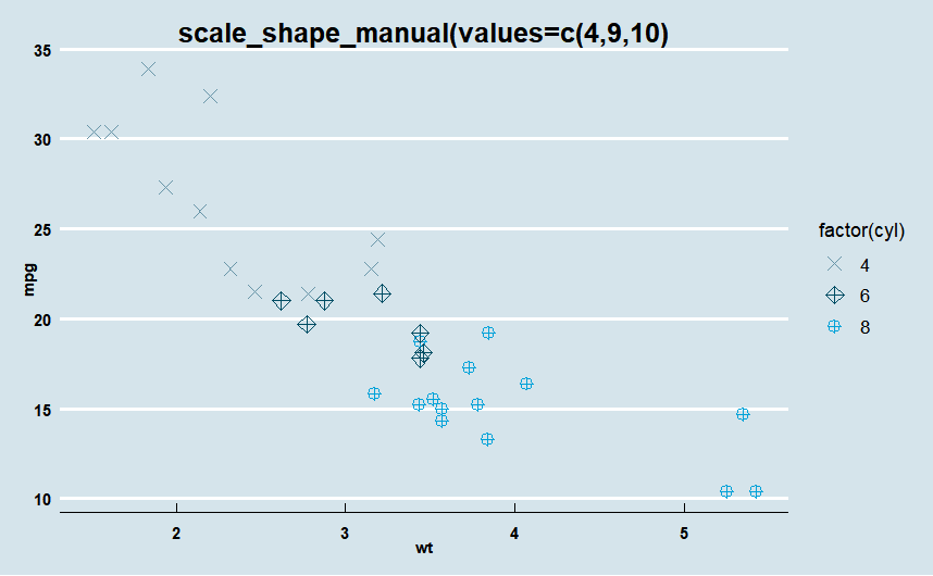
03. scale_shape_manual()
· scale_shape_manual()을 사용해서 point의 shape을 지정할 수 있음
ggplot(mtcars) +
  geom_point(aes(x = wt,  y = mpg,
                 color = factor(cyl),
                 shape = factor(cyl)),
             size = 3)+
  labs(title = "scale_shape_manual(values=c(4,9,10)")+
  scale_shape_manual(values=c(4,9,10))+ # 자동으로 지정됐던 shape을 선택해서 지정 가능.

  theme_economist()+
  scale_color_manual(values =economist_pal(fill = TRUE)(3))+
  theme(plot.title=element_text(family="nanumgothic", face="bold",
                                   hjust=0.5, vjust=1, size=15),
        axis.text=element_text(family="nanumgothic", face="bold", size=9),
        axis.title =element_text(family="nanumgothic", face="bold", size=9),
        legend.text = element_text(family="nanumgothic", size=10),
        legend.position='right')
참고 문헌(reference)
참고 서적 / 위키북스|Must Learning with R (개정판)
https://wikidocs.net/book/4315
Must Learning with R (개정판)
MustLearning with R 개정판입니다. 기존 제작한 책에서 다시 만들려고 했으나, 책의 구성이 어느정도 바뀐 부분도 있기 때문에 다시 새롭게 구성을 하였습…
wikidocs.net
참고 사이트
https://ggplot2.tidyverse.org/reference/geom_point.html#ref-examples
Points — geom_point
The point geom is used to create scatterplots. The scatterplot is most useful for displaying the relationship between two continuous variables. It can be used to compare one continuous and one categorical variable, or two categorical variables, but a varia
ggplot2.tidyverse.org
http://www.sthda.com/english/wiki/ggplot2-point-shapes
ggplot2 point shapes - Easy Guides - Wiki - STHDA
Statistical tools for data analysis and visualization
www.sthda.com
[withR]좀더 하는 ggplot2-Gropuping Data Points(모양과 색을 이용하여 산점도 그룹화 시키기)
#library(gcookbook)
medium.com
'R > ggplot2' 카테고리의 다른 글
| R | ggplot2 | Text (geom_text) (0) | 2023.01.19 |
|---|---|
| R | ggplot2 | Line Plot (0) | 2023.01.18 |
| R | ggplot2 | Boxplot (0) | 2023.01.16 |
| R | ggplot2 | Density Plot (밀도 플롯) (0) | 2023.01.16 |
| R | ggplot2 | Histogram (0) | 2023.01.10 |