
Density Plot , 밀도 플롯은 숫자형 변수(연속형)의 분포를 볼 때 유용하다.
Density Plot은 히스토그램의 평활화 버전으로 데이터의 분포를 근사적으로 파악하는 데 도움을 줌.
ggplot2 패키지에서는 Density Plot을 그리기 위해서 geom_density( ) 함수를 제공한다.
geom_density(
  mapping = NULL,
  data = NULL,
  stat = "density",
  position = "identity",
  ...,
  na.rm = FALSE,
  orientation = NA,
  show.legend = NA,
  inherit.aes = TRUE,
  outline.type = "upper"
)
· 주요 Argument
| 사용 방법 | 설명 | |
| adjust | adjust = n | 밀도 곡선의 평활성 설정, 숫자가 작을 수록 울퉁불퉁해짐 |
| position | position = "identity" | stack, fill, identity, dodge |
| fill | 1) aes(fill = 변수) 2) geom_density(aes(), fill = "컬러코드") |
|
| color | 밀도 곡선 색상 1) aes( color = 변수) 2) geom_density(aes(), color = "컬러코드") |
|
| size | 밀도 곡선 두께 size = 1 |
|
| alpha | alpha = n | 0 <= n <= 1, 0으로 갈수록 투명해짐 |
00. 사용 데이터
·데이터는 ggplot2 패키지 데이터 셋인 'diamonds' 사용
library(ggplot2) # 패키지 로드

df <- diamonds
df %>% str()
df %>% head()
01. 기본 Density Plot
·diamonds의 carat의 분포
library(ggthemes) #theme_economist 테마를 사용하기 위한 library


ggplot(diamonds) +
  geom_density(aes(x =carat), size = 1)+
    labs(title = "기본 Density Plot")+
    theme_economist() +
    theme(plot.title=element_text(family="nanumgothic", face="bold", size=15),
          axis.text=element_text(family="nanumgothic", face="bold", size=10),
          legend.position='bottom')

02. adjust 조정 Density Plot
1) adjust = 0.2
ggplot(diamonds) +
  geom_density(aes(x =carat), size = 1, adjust = 1/5)+
    labs(title = "adjust = 0.2")+
    theme_economist() +
    theme(plot.title=element_text(family="nanumgothic", face="bold", size=15),
          axis.text=element_text(family="nanumgothic", face="bold", size=10),
          legend.position='bottom')
2) adjust = 5
ggplot(diamonds) +
  geom_density(aes(x =carat), size = 1, adjust = 5)+
    labs(title = "adjust = 5")+
    theme_economist() +
    theme(plot.title=element_text(family="nanumgothic", face="bold", size=15),
          axis.text=element_text(family="nanumgothic", face="bold", size=10),
          legend.position='bottom')


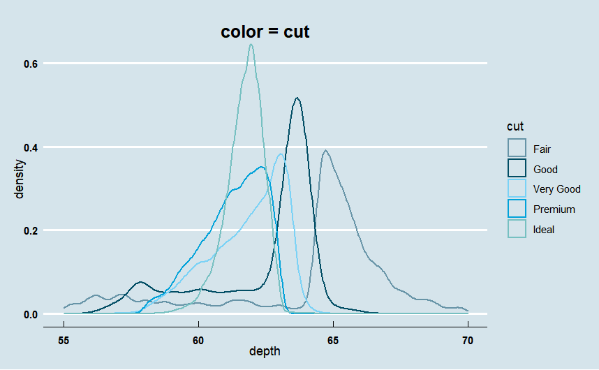
03. color 변경
· diamonds 데이터 셋의 depth의 분포를 cut(범주형 변수)별로 곡선의 색상을 달리하여 plotting
ggplot(diamonds) +
  geom_density(aes(x =depth, color = cut), size = 0.8)+
    xlim(55,70)+  # X축의 범위를 55에서 70사이로 설정
    labs(title = "color = cut")+
    theme_economist() +
    scale_color_manual(values = economist_pal(fill = TRUE)(5))+ # 선 색상 팔레트를 사용하여 지정
    theme(plot.title=element_text(family="nanumgothic", face="bold",
                                   hjust=0.5, vjust=-2, size=15),
          axis.text=element_text(family="nanumgothic", face="bold", size=9),
          legend.text = element_text(family="nanumgothic", size=9),
          legend.position='right')
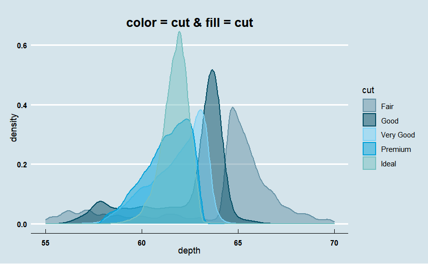
04. fill 색상 지정
· 위에 color = cut으로 지정한 그래프에 fill = cut을 추가하여 plotting
ggplot(diamonds) +
  geom_density(aes(x =depth, color = cut, fill = cut), size = 0.8, alpha = .5)+
    xlim(55,70)+
    labs(title = "color = cut & fill = cut")+
    theme_economist() +
    scale_color_manual(values = economist_pal(fill = TRUE)(5))+
    scale_fill_manual(values =economist_pal(fill = TRUE)(5))+
    theme(plot.title=element_text(family="nanumgothic", face="bold",
                                   hjust=0.5, vjust=-2, size=15),
          axis.text=element_text(family="nanumgothic", face="bold", size=9),
          legend.text = element_text(family="nanumgothic", size=9),
          legend.position='right')
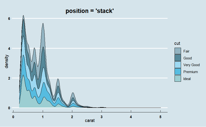
05. 누적 밀도 그래프 (position ="stack")
· carat 변수를 cut 변수에 따라 누적 밀도 그래프로 plotting
· position = "stack" 사용
ggplot(diamonds) +
  geom_density(aes(x =carat, fill = cut),
               position = "stack", alpha = .6)+
    labs(title = "position = 'stack'")+

    theme_economist() +
    scale_fill_manual(values =economist_pal(fill = TRUE)(5))+
    theme(plot.title=element_text(family="nanumgothic", face="bold",
                                   hjust=0.5, vjust=-2, size=15),
          axis.text=element_text(family="nanumgothic", face="bold", size=9),
          legend.text = element_text(family="nanumgothic", size=9),
          legend.position='right')
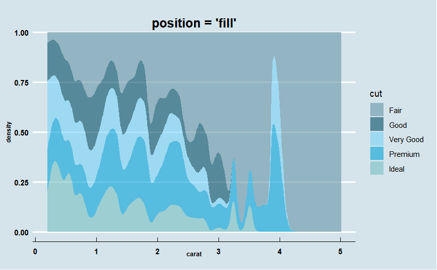
06. 누적 밀도 그래프를 비율로 (position ="fill")
· carat 변수를 cut 변수에 따라 누적 밀도 그래프를 그리 돼, Y축을 0에서 1사이의 누적 비율로 표현
· position = "fill" 사용
ggplot(diamonds) +
  geom_density(aes(x =carat, fill = cut),
               position = "fill",
               color = NA, alpha = .6)+
    labs(title = "position = 'fill'")+
    theme_economist() +
    scale_fill_manual(values =economist_pal(fill = TRUE)(5))+
    theme(plot.title=element_text(family="nanumgothic", face="bold",
                                   hjust=0.5, vjust=-2, size=15),
          axis.text=element_text(family="nanumgothic", face="bold", size=9),
          axis.title =element_text(family="nanumgothic", face="bold", size=7,
                                   hjust = 0.5, vjust = 4),
          legend.text = element_text(family="nanumgothic", size=9),
          legend.position='right')
참고 문헌(reference)
참고 서적 / 위키북스|Must Learning with R (개정판)
https://wikidocs.net/book/4315
Must Learning with R (개정판)
MustLearning with R 개정판입니다. 기존 제작한 책에서 다시 만들려고 했으나, 책의 구성이 어느정도 바뀐 부분도 있기 때문에 다시 새롭게 구성을 하였습…
wikidocs.net
참고 사이트
https://ggplot2.tidyverse.org/reference/geom_density.html
Smoothed density estimates — geom_density
Computes and draws kernel density estimate, which is a smoothed version of the histogram. This is a useful alternative to the histogram for continuous data that comes from an underlying smooth distribution.
ggplot2.tidyverse.org
[R] ggplot(), geom_density() (1) 밀도 플롯 기본 : 밀도곡선 그래프로 데이터 빈도 분포 시각화(density curv
밀도 그림, 밀도 플롯(Density Plot) 밀도 그림은 숫자 변수의 분포를 나타내는 시각화 방법입니다. 밀도...
blog.naver.com
'R > ggplot2' 카테고리의 다른 글
| R | ggplot2 | Line Plot (0) | 2023.01.18 |
|---|---|
| R | ggplot2 | Scatter Plot(산점도) (0) | 2023.01.17 |
| R | ggplot2 | Boxplot (0) | 2023.01.16 |
| R | ggplot2 | Histogram (0) | 2023.01.10 |
| R | ggplot2 | bar chart (0) | 2023.01.03 |