Line Plot, 선 그래프는 x축의 연속형 변수 or 순서나 크기가 있는 이산형 변수, ordered factor의 변화에 따른 y축의 변화를 선으로 이어서 보여주는 그래프이다.
여기서 x축이 시간의 순서이면 시계열 그래프(Time Series Graph)가 된다.
ggplot2 패키지에서는 선 그래프를 그리기 위한 geom_path(), geom_line() 함수를 제공한다.
이번 포스팅에서는 geom_line()를 사용하여 선 그래프를 그릴 것이다.
geom_line(
  mapping = NULL,
  data = NULL,
  stat = "identity",
  position = "identity",
  na.rm = FALSE,
  orientation = NA,
  show.legend = NA,
  inherit.aes = TRUE,
  ...
)
· 주요 Argument
| Argument | 사용 방법 | 설명 |
| group | 1) aes(group =범주형 변수) | 선은 동일한 x에서 하나의 y값만을 가져야하는 특징을 지니고 있기 때문에 선 그래프를 그리기 전에는 항상 이 점을 유의해서 요약값을 만들어 준 후, 그래프를 그려야 한다. 이를 위해선 group 속성에 범주형 변수를 매핑함으로써 group 별로 선 그래프를 그려줘야 한다. |
| color | 선의 색상 지정 1) color = "컬러코드" 2) aes(color = 범주형변수) |
1) mapping 밖에 사용할 경우 line의 색상을 지정할 수 있음 2) mapping 안에 color를 범주형 변수로 지정해서 line 색을 범주별로 달리 할 수 있음. |
| linetype | 선의 종류를 지정할 수 있음 1) linetype = 2 2) aes(linetype = 범주형 변수) |
|
| lineend | 선의 끝 모양을 지정할 수 있음 1) lineend = "round" |
"round", "butt", or "square". "butt"이 default 값임. |
| size | 선의 두께를 지정 | |
| alpha | alpha = n | 0 <= n <= 1, 0으로 갈수록 투명해짐 |
| arrow | 선에 화살표 추가할 수 있음 |
geom_line(arrow = arrow(angle = 30, length = unit(0.25, "inches"), ends = "last", type = "open") |
00. 사용 데이터
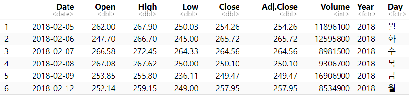
·2018년 2월 5일부터 2022년 2월5일까지 시계열을 이용한 넷플릭스 주가 예측 데이터
stock <- read.csv(file.choose())

stock$Date <-  as.Date(stock$Date) # 데이터 자료형 변환
stock$Year <-  as.factor(format(stock$Date,"%Y")) #2018
stock$Day <-  as.factor(format(stock$Date,"%a")) #월,화,수,...
01. 기본 라인 그래프
· 2018년 2월 5일부터 2022년 5월까지의 넷플릭스 Open(개장) 가격 변화
· x = Date, y = Open
ggplot(stock)+
  geom_line(aes(x = Date, y = Open))+
  labs(title = "기본 라인 그래프")+

  theme_economist()+
  theme(plot.title=element_text(family="nanumgothic", face="bold",
                                   hjust=0.5, vjust=1, size=15),
        axis.text=element_text(family="nanumgothic", face="bold", size=9),
        axis.title =element_text(family="nanumgothic", face="bold", size=9)
        )

02. 라인 그래프 커스텀
02-1. Group
· R 내장 데이터 셋인 'Orange' 사용
1) 그룹을 지정하지 않았을 경우
ggplot(Orange)+
  geom_line(aes(x = age , y = circumference),
            size =1.5)+
  labs(title = "age에 따른 circumference 변화")+

  theme_economist()+
  theme(plot.title=element_text(family="nanumgothic", face="bold",
                                   hjust=0.5, vjust=1, size=15),
        axis.text=element_text(family="nanumgothic", face="bold", size=9,
                               hjust=0.5, vjust=1),
        axis.title =element_text(family="nanumgothic", face="bold", size=9))

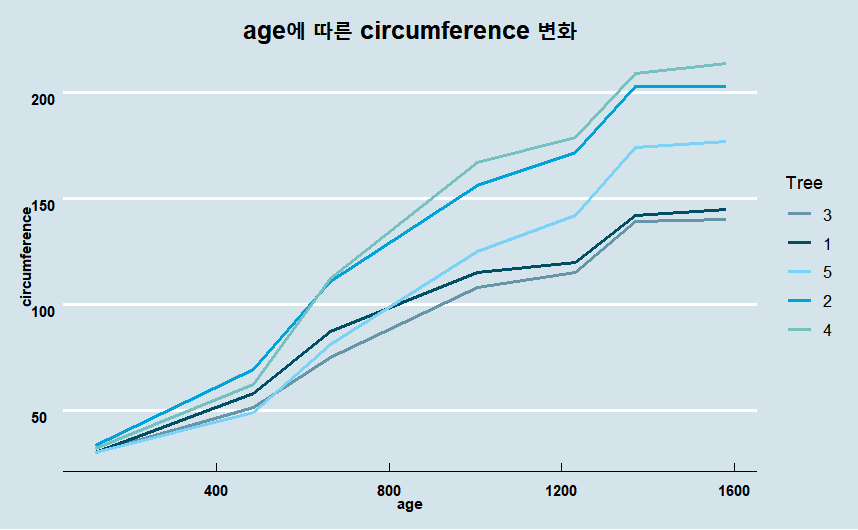
위의 그래프는 age별로 1번부터 5번까지의 나무가 나타내는 값을 모두 선으로 이은 그래프이다. 동일한 나이 대의 데이터가 많아서 하나의 선으로 연결한 그래프는 성장의 변화를 한 눈에 보기 어렵다.
선은 동일한 x에서 하나의 y값만을 가져야하는 특징을 지니고 있으며, 선 그래프를 그리기 전에는 항상 이 점을 유의해서 요약값을 만들어 준 후, 그래프를 작성해야 한다.
이를 해결하기 위해서는 group 속성에 Tree 변수를 매핑해야한다.
2) 그룹을 지정한 경우
· group 속성에 Tree 변수 매핑
ggplot(Orange)+
  geom_line(aes(x = age , y = circumference, group = Tree),
            size =1)+
  labs(title = "age에 따른 circumference 변화")+

  theme_economist()+
  theme(plot.title=element_text(family="nanumgothic", face="bold",
                                   hjust=0.5, vjust=1, size=15),
        axis.text=element_text(family="nanumgothic", face="bold", size=9,
                               hjust=0.5, vjust=1),
        axis.title =element_text(family="nanumgothic", face="bold", size=9),
        legend.text = element_text(family="nanumgothic", size=10),
        legend.position='right')

02-2. Color
1) mapping 밖에 color = "컬러코드"
ggplot(Orange)+
  geom_line(aes(x = age , y = circumference, group = Tree),
            color = "#317589",
            size =1)+
  labs(title = "age에 따른 circumference 변화")+

  theme_economist()+
  theme(plot.title=element_text(family="nanumgothic", face="bold",
                                   hjust=0.5, vjust=1, size=15),
        axis.text=element_text(family="nanumgothic", face="bold", size=9,
                               hjust=0.5, vjust=1),
        axis.title =element_text(family="nanumgothic", face="bold", size=9))

2) mapping 안에 변수에 따른 color 지정
· aes(color = "범주형 변수")
· Tree의 종류를 구별하기 위해 aes(color = Tree) 매핑
ggplot(Orange)+
  geom_line(aes(x = age , y = circumference, group = Tree, color = Tree),
            size =1)+
  labs(title = "age에 따른 circumference 변화")+

  theme_economist()+
  scale_color_manual(values =economist_pal(fill = TRUE)(5))+
  theme(plot.title=element_text(family="nanumgothic", face="bold",
                                   hjust=0.5, vjust=1, size=15),
        axis.text=element_text(family="nanumgothic", face="bold", size=9,
                               hjust=0.5, vjust=1),
        axis.title =element_text(family="nanumgothic", face="bold", size=9),
        legend.text = element_text(family="nanumgothic", size=10),
        legend.position='right')

02-3. linetype
1) 변수별로 linetype 변경
· linetype 속성에 Tree 변수를 매핑하면 자동으로 Tree의 종류별로 linetype을 변경해 줌.
ggplot(Orange)+
  geom_line(aes(x = age , y = circumference, color = Tree,
                linetype = Tree),
            size =1)+
  labs(title = "linetype = Tree")+

  theme_economist()+
  scale_color_manual(values =economist_pal(fill = TRUE)(5))+
  theme(plot.title=element_text(family="nanumgothic", face="bold",
                                   hjust=0.5, vjust=1, size=15),
        axis.text=element_text(family="nanumgothic", face="bold", size=9,
                               hjust=0.5, vjust=1),
        axis.title =element_text(family="nanumgothic", face="bold", size=9),
        legend.text = element_text(family="nanumgothic", size=10),
        legend.position='right')

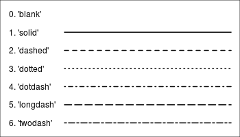
2) scale_linetype_manual() 으로 linetype 사용자 지정 가능
·linetype 0~6까지 지정 가능.
ggplot(Orange)+
  geom_line(aes(x = age , y = circumference, color = Tree, linetype = Tree),
            size =1)+
  labs(title = "scale_linetype_manual")+
  scale_linetype_manual(values =c(2,3,4,5,1))+

  theme_economist()+
  scale_color_manual(values =economist_pal(fill = TRUE)(5))+
  theme(plot.title=element_text(family="nanumgothic", face="bold",
                                   hjust=0.5, vjust=1, size=15),
        axis.text=element_text(family="nanumgothic", face="bold", size=9,
                               hjust=0.5, vjust=1),
        axis.title =element_text(family="nanumgothic", face="bold", size=9),
        legend.text = element_text(family="nanumgothic", size=10),
        legend.position='right')

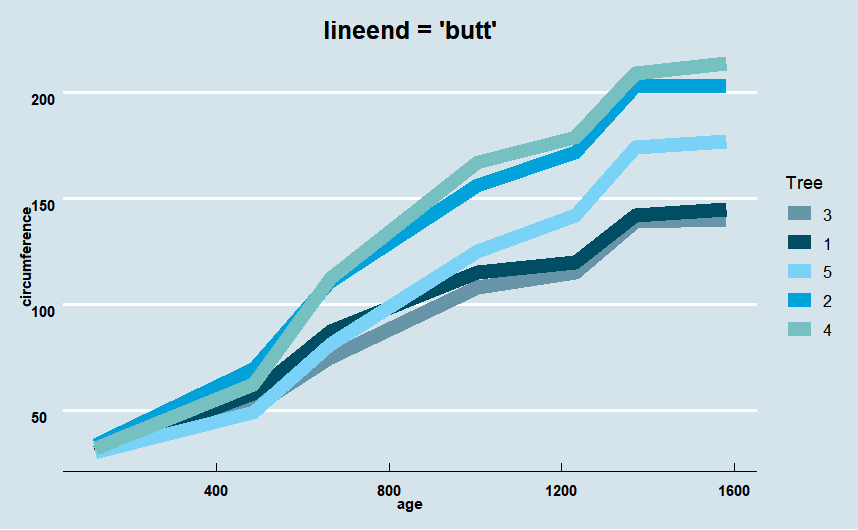
02-4. lineend
· lineend 속성을 사용해 선의 끝 모양을 지정할 수 있음
· "round", "butt", or "square" 총 3가지이며 "butt"이 default 값이다.
1) lineend = "round"
ggplot(Orange)+
  geom_line(aes(x = age , y = circumference, group = Tree, color = Tree),
            size =4, lineend = "round")+
  labs(title = "lineend = 'round'")+

  theme_economist()+
  scale_color_manual(values =economist_pal(fill = TRUE)(5))+
  theme(plot.title=element_text(family="nanumgothic", face="bold",
                                   hjust=0.5, vjust=1, size=15),
        axis.text=element_text(family="nanumgothic", face="bold", size=9,
                               hjust=0.5, vjust=1),
        axis.title =element_text(family="nanumgothic", face="bold", size=9),
        legend.text = element_text(family="nanumgothic", size=10),
        legend.position='right')

2) lineend = "butt"
ggplot(Orange)+
  geom_line(aes(x = age , y = circumference, group = Tree, color = Tree),
            size =4, lineend = "butt")+
  labs(title = "lineend = 'butt'")+

  theme_economist()+
  scale_color_manual(values =economist_pal(fill = TRUE)(5))+
  theme(plot.title=element_text(family="nanumgothic", face="bold",
                                   hjust=0.5, vjust=1, size=15),
        axis.text=element_text(family="nanumgothic", face="bold", size=9,
                               hjust=0.5, vjust=1),
        axis.title =element_text(family="nanumgothic", face="bold", size=9),
        legend.text = element_text(family="nanumgothic", size=10),
        legend.position='right')
3) lineend = "square"
ggplot(Orange)+
  geom_line(aes(x = age , y = circumference, group = Tree, color = Tree),
            size =4, lineend = "square")+
  labs(title = "lineend = 'square'")+

  theme_economist()+
  scale_color_manual(values =economist_pal(fill = TRUE)(5))+
  theme(plot.title=element_text(family="nanumgothic", face="bold",
                                   hjust=0.5, vjust=1, size=15),
        axis.text=element_text(family="nanumgothic", face="bold", size=9,
                               hjust=0.5, vjust=1),
        axis.title =element_text(family="nanumgothic", face="bold", size=9),
        legend.text = element_text(family="nanumgothic", size=10),
        legend.position='right')

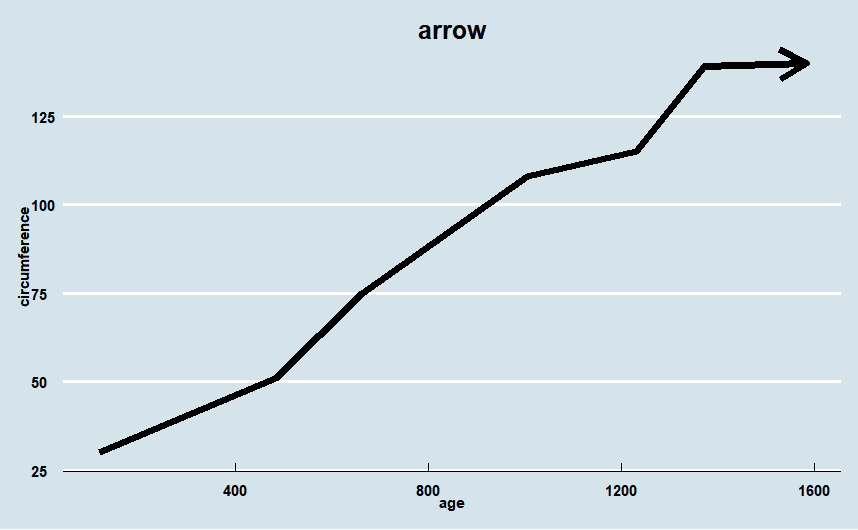
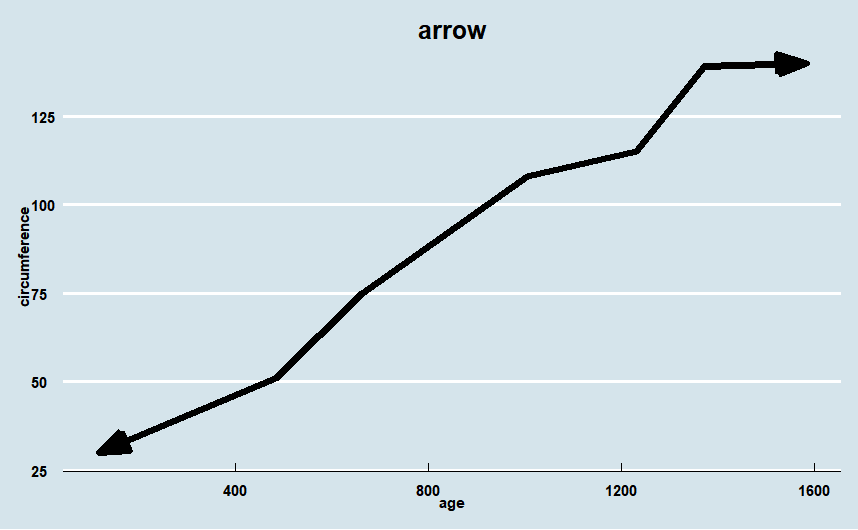
02-5. arrow
· arrow() 함수를 사용하여 선 그래프에 화살표를 추가할 수 있다.
ggplot(Orange %>% filter(Tree == '3'))+
  geom_line(aes(x = age , y = circumference),
            size =2,
            arrow = arrow())+
  labs(title = "arrow")+

  theme_economist()+
  theme(plot.title=element_text(family="nanumgothic", face="bold",
                                   hjust=0.5, vjust=1, size=15),
        axis.text=element_text(family="nanumgothic", face="bold", size=9),
        axis.title =element_text(family="nanumgothic", face="bold",
                                 hjust=0.5, vjust=1,size=9))
ggplot(Orange %>% filter(Tree == '3'))+
  geom_line(aes(x = age , y = circumference),
            size =2,
            arrow = arrow(angle = 20, ends = "both", type = "closed"))+
  labs(title = "arrow")+

  theme_economist()+
  theme(plot.title=element_text(family="nanumgothic", face="bold",
                                   hjust=0.5, vjust=1, size=15),
        axis.text=element_text(family="nanumgothic", face="bold", size=9),
        axis.title =element_text(family="nanumgothic", face="bold",
                                 hjust=0.5, vjust=1,size=9))
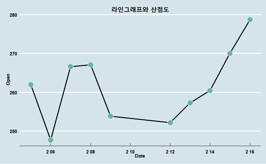
03. geom_line() + geom_point()
· geom_line() 으로 선 그래프를 먼저 그리고 geom_point() 함수를 추가하여 선 그래프와 산점도를 같이 그릴 수 있다.
· 위에서 사용한 넷플릭스 주가 데이터를 2018-02-01 ~ 2018-02-15 날짜만 필터링
ggplot(stock %>% head(10))+ # 2018-02-05 ~ 2018-02-16
  geom_line(aes(x = Date, y = Open), size =1)+
  geom_point(aes(x = Date, y = Open),
             shape=21, color="white", fill="#69b3a2", size=5)+
  labs(title = "라인그래프와 산점도")+

  theme_economist()+
  theme(plot.title=element_text(family="nanumgothic", face="bold",
                                   hjust=0.5, vjust=1, size=15),
        axis.text=element_text(family="nanumgothic", face="bold", size=9),
        axis.title =element_text(family="nanumgothic", face="bold", size=9)
        )
04. geom_text() 추가
· geom_text()를 사용하면 해당 x,y좌표의 값이 무엇인지 한 눈에 알아볼 수 있다.
ggplot(stock %>% head(10))+ # 2018-02-05 ~ 2018-02-16
  geom_line(aes(x = Date, y = Open), size =1, color = "grey")+
  geom_point(aes(x = Date, y = Open),
             shape=21, color="white", fill="#69b3a2", size=5)+
  geom_text(aes(x = Date, y = Open, label =round(Open,2)),
            vjust = -1.5)+
  labs(title = "라인그래프와 산점도")+

  theme_economist()+
  theme(plot.title=element_text(family="nanumgothic", face="bold",
                                   hjust=0.5, vjust=1, size=15),
        axis.text=element_text(family="nanumgothic", face="bold", size=9),
        axis.title =element_text(family="nanumgothic", face="bold", size=9)
        )
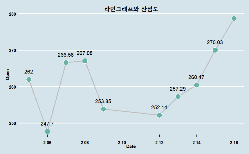
더 많은 geom_text()의 기능은 다음 포스팅으로 ......!
참고 문헌(reference)
사용 데이터
https://www.kaggle.com/datasets/jainilcoder/netflix-stock-price-prediction?select=NFLX.csv
참고 서적 / 위키북스|Must Learning with R (개정판)
https://wikidocs.net/book/4315
Must Learning with R (개정판)
MustLearning with R 개정판입니다. 기존 제작한 책에서 다시 만들려고 했으나, 책의 구성이 어느정도 바뀐 부분도 있기 때문에 다시 새롭게 구성을 하였습…
wikidocs.net
참고 사이트
https://ggplot2.tidyverse.org/reference/geom_path.html
Connect observations — geom_path
geom_path() connects the observations in the order in which they appear in the data. geom_line() connects them in order of the variable on the x axis. geom_step() creates a stairstep plot, highlighting exactly when changes occur. The group aesthetic determ
ggplot2.tidyverse.org
https://m.blog.naver.com/coder1252/221031694057
R - ggplot2 - line 그래프
1. geom_lineR의 내장 데이터인 Orange를 사용하겠습니다. Orange는 1부터 5까지의 나무의 나이에 따른 ...
blog.naver.com
https://www.statology.org/ggplot-line-type/
How to Change Line Type in ggplot2 - Statology
This tutorial explains how to change line type in ggplot2, including several examples.
www.statology.org
[withR]좀더 하는 ggplot2-Appearance of Line(선의 표현)
#library(ggplot2)
medium.com
'R > ggplot2' 카테고리의 다른 글
| R | ggmap | 지도 시각화(1) (0) | 2023.01.25 |
|---|---|
| R | ggplot2 | Text (geom_text) (0) | 2023.01.19 |
| R | ggplot2 | Scatter Plot(산점도) (0) | 2023.01.17 |
| R | ggplot2 | Boxplot (0) | 2023.01.16 |
| R | ggplot2 | Density Plot (밀도 플롯) (0) | 2023.01.16 |