이전 포스팅에서 plotly 패키지를 이용해 산점도를 시각화하였다.
산점도는 두 가지의 변수 간의 상관관계를 나타낼 때 유용하게 사용되는 데,
산점도의 한 종류인 버블 차트를 사용하면 세 가지의 변수를 사용하여 산점도를 그릴 수 있다.
세 번째 연속형 변수의 크기에 따라 버블로 표현할 수 있다.
plotly 패키지를 사용하여 버블차트를 시각화하기 위해서는 산점도 trace에서 marker 속성 list에 size 속성을 사용하면 된다.
plotly_bubble-chart.html
4.67MB
00. 패키지 로드 및 데이터 불러오기
## 패키지 로드
library(dplyr)
library(plotly)
library(RColorBrewer)
### 한글 폰트 설정
library(showtext)
font_add_google("Nanum Gothic", "nanumgothic")

## 데이터 불러오기 : 학력별 소득 데이터
data <- read.csv("https://raw.githubusercontent.com/plotly/datasets/master/school_earnings.csv")
data %>% head()

01. 기본 bubble chart
- 대학별 여성과 남성의 소득차이(Gap)를 보기 위해 x축에 여성의 소득, y축에 남성의 소득을 매핑한 후
marker = list(size = ~Gap)으로 매핑
plot_ly(data=data, x=~Women, y=~Men,
        type='scatter',
        mode="markers",
        marker = list(size = ~Gap)) %>%

  layout(title = "대학별 여성과 남성의 소득차이(Gap)",
         font=list(family ='nanumgothic'),
         xaxis = list(title="", zeroline = F),
         yaxis = list(title="", zeroline = F),
         margin = list(l=10, r=20, b=10, t=30, pad=0))

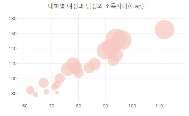
02. color 속성
1) 전체 버블 색상 바꾸기
- 버블의 채우기 색을 변경하려면
marker 속성 list에 color = "컬러코드"를 지정하면 된다.
plot_ly(data=data, x=~Women, y=~Men,
        type='scatter',
        mode="markers",
        marker = list(size = ~Gap,
                      color = "#F6C6BD")) %>%

  layout(title = "대학별 여성과 남성의 소득차이(Gap)",
         font=list(family ='nanumgothic'),
         xaxis = list(title="", zeroline = F),
         yaxis = list(title="", zeroline = F),
         margin = list(l=10, r=20, b=10, t=30, pad=0))

- 버블의 외곽 라인의 색 변경하려면
위의 marker 속성의 list에 line = list( color = "컬러코드")를 추가하면 된다.
plot_ly(data=data, x=~Women, y=~Men,
        type='scatter',
        mode="markers",
        marker = list(size = ~Gap,
                      color = "#F6C6BD",
                      line = list(color = "#F6C6BD"))) %>%

  layout(title = "대학별 여성과 남성의 소득차이(Gap)",
         font=list(family ='nanumgothic'),
         xaxis = list(title="", zeroline = F),
         yaxis = list(title="", zeroline = F),
         margin = list(l=10, r=20, b=10, t=30, pad=0))
2) 연속형 변수를 color 속성에 매핑하기
- 연속형 변수 'Gap'을 trace의 color 속성에 매핑하면 Gap의 크기에 따라 색을 달리할 수 있다.
plot_ly(data=data, x=~Women, y=~Men,
        color = ~Gap, colors = 'Reds', # Gap을 color에 매핑하고, colors 속성을 사용해서 팔레트 지정
        type='scatter',
        mode="markers",
        marker = list(size = ~Gap)) %>%

  layout(title = "대학별 여성과 남성의 소득차이(Gap)",
         font=list(family ='nanumgothic'),
         xaxis = list(title="", zeroline = F),
         yaxis = list(title="", zeroline = F),
         margin = list(l=10, r=20, b=10, t=30, pad=0))

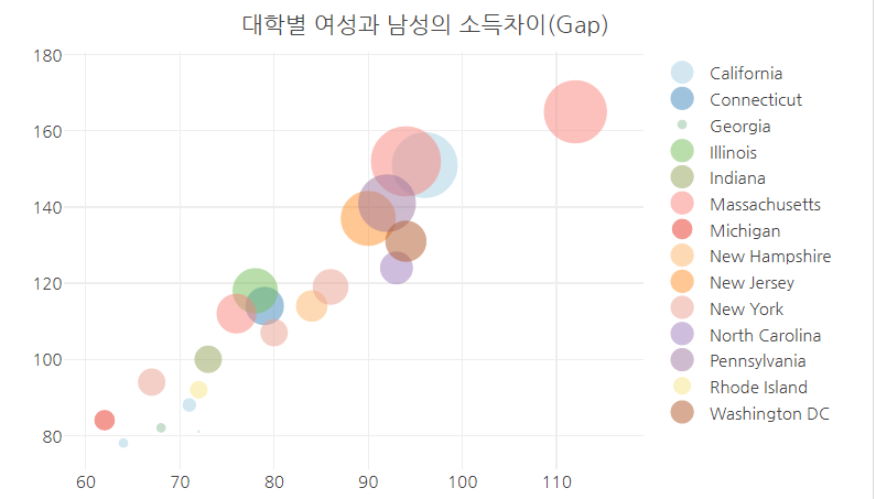
3) 범주형 변수를 color 속성에 매핑하기
## 범주형 변수 추가
data$State <- as.factor(c('Massachusetts', 'California', 'Massachusetts', 'Pennsylvania', 'New Jersey', 'Illinois', 'Washington DC',
                          'Massachusetts', 'Connecticut', 'New York', 'North Carolina', 'New Hampshire', 'New York', 'Indiana',
                          'New York', 'Michigan', 'Rhode Island', 'California', 'Georgia', 'California', 'California'))


plot_ly(data, x = ~Women, y = ~Men, text = ~Gap,
        type = 'scatter', mode = 'markers',
        size = ~Gap,
        color = ~State, # 범주형 변수
        colors = 'Paired',
        marker = list(opacity = 0.5, sizemode = 'diameter')) %>%

  layout(title = "대학별 여성과 남성의 소득차이(Gap)",
         font=list(family ='nanumgothic'),
         xaxis = list(title="", zeroline = F),
         yaxis = list(title="", zeroline = F),
         margin = list(l=10, r=10, b=0, t=30, pad=0))

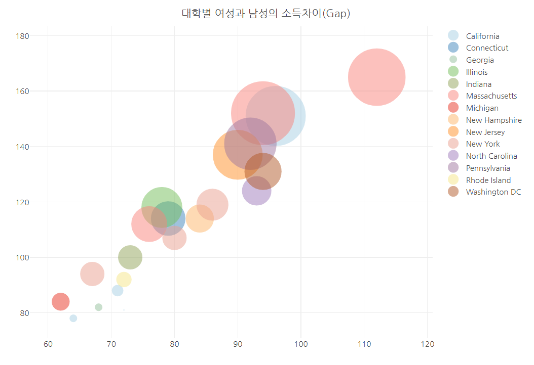
03. 버블의 size 스케일 조정
- sizes 속성에 c(최소 사이즈, 최대 사이즈)를 지정해 주면 된다.
plot_ly(data, x = ~Women, y = ~Men, text = ~Gap,
        color = ~State, colors = 'Paired', #범주형
        size = ~Gap, #범주형
        sizes =c(1,100),
        type='scatter',
        mode="markers",
        marker = list(opacity = 0.5, sizemode ='diameter')) %>%

  layout(title = "대학별 여성과 남성의 소득차이(Gap)",
         font=list(family ='nanumgothic'),
         xaxis = list(title="", zeroline = F),
         yaxis = list(title="", zeroline = F),
         margin = list(l=10, r=20, b=10, t=30, pad=0))
참고 문헌(reference)
'R > plotly' 카테고리의 다른 글
| R | plotly | Pie chart - 원 그래프 (0) | 2023.02.03 |
|---|---|
| R | plotly | Line Plot - 선 그래프 (1) | 2023.02.02 |
| R | plotly | Scatter Plot - 산점도 (0) | 2023.02.01 |
| R | plotly | Violin Plot - 바이올린 플롯 (0) | 2023.01.31 |
| R | plotly | box plot (0) | 2023.01.31 |